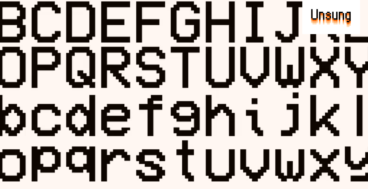
Reviving Pixel Fonts: From Nostalgia to Modern Precision
Pixel fonts have been around for decades, but recent efforts are reshaping them beyond mere nostalgia. Andrew Gleeson’s Analog Mono tackles a long-standing problem: the uneven baselines that plagued 1990s pixel fonts like the VCR OSD Mono. By smoothing these quirks, Gleeson makes the font reliable for modern screens without losing its vintage charm. This isn’t just a cosmetic fix; it’s about adapting pixel fonts to today’s higher-resolution, diverse display environments.
Meanwhile, Kumiko Yoshida’s Coral Pixels flips a traditional pixel rendering flaw—colorful subpixel fringing—into a deliberate design choice. What was once an unwanted artifact now serves as a vibrant stylistic element, pushing pixel fonts into new visual territory. These developments show pixel fonts aren’t stuck in the past. They’re evolving with technical finesse and creative boldness, bridging retro aesthetics with modern precision.
Innovations in Pixel Font Design and Functionality
Andrew Gleeson’s Analog Mono tackles a persistent flaw in pixel fonts: baseline inconsistency. Drawing from the 1990s VCR OSD Mono font, Gleeson refined the design to stabilize character alignment. This adjustment isn’t just cosmetic. By anchoring the baseline firmly, Analog Mono ensures text appears more uniform across different displays and resolutions. It blends nostalgia with practical improvements, making it a reliable choice for today’s digital environments.
Kumiko Yoshida’s Coral Pixels takes a different route. Instead of hiding subpixel fringing—usually seen as a rendering glitch—Yoshida embraces it as a deliberate design element. The font incorporates colorful fringes at the edges of characters, turning what was once an artifact into a stylistic tool. This approach challenges traditional pixel font aesthetics and introduces a fresh visual texture that catches the eye without sacrificing legibility.
Joseph Fatula’s Two Slice pushes the boundaries of minimalism with a font just two pixels tall. It’s less about readability and more about experimentation within extreme constraints. Two Slice questions how much information a pixel font can convey at such a tiny scale. While it’s not practical for everyday use, its existence sparks discussion about the limits and possibilities of pixel-based typography.
Vercel’s Geist Pixel addresses pixel fonts from a systems perspective. It’s not just a typeface but a practical extension designed to solve technical hurdles like scalability and metric conflicts. Geist Pixel prioritizes typographic precision, ensuring consistent spacing and sizing across platforms. This makes it especially useful for designers working in production environments who need pixel fonts that perform reliably beyond aesthetics.
Together, these developments mark a shift from pixel fonts as nostalgic throwbacks to purposeful tools. They confront old limitations—whether baseline shifts, rendering artifacts, or scalability issues—with targeted technical solutions. The result is a diverse set of fonts that respect pixel art’s heritage while adapting to modern design demands.
Challenges and Heritage of Pixel Fonts
Pixel fonts carry a legacy tangled with technical compromises and visual quirks. Their roots trace back to early digital displays—think low-res monitors and VCR on-screen menus—where every pixel counted. Designers had to work within tight constraints: limited resolution, inconsistent baselines, and crude rendering engines. These limitations often led to uneven letter alignment and jittery curves that, while charming in retrospect, posed real headaches for readability and consistency.
Take the 1990s VCR OSD Mono font, for example. Its baseline inconsistencies weren’t just cosmetic flaws; they reflected the hardware and software constraints of the era. Such quirks became part of pixel fonts’ identity but also restricted their use beyond nostalgic or very specific contexts.
Modern pixel font designers face the challenge of honoring this heritage while pushing past its boundaries. They must reconcile the pixel-perfect aesthetic with today’s demands for scalability, clarity on diverse screens, and smooth integration into complex digital environments. This means addressing issues like metric conflicts and rendering artifacts that were once accepted as unavoidable.
In this light, recent innovations aren’t just about reviving old styles. They’re about refining and reinterpreting pixel fonts with a technical rigor that fits modern workflows. The goal shifts from merely preserving pixel charm to creating fonts that perform reliably without losing their distinctive edge. This balancing act defines much of the current pixel font design landscape.
What These Pixel Fonts Mean for Designers Today
Pixel fonts have long been pigeonholed as relics of early digital displays—quirky, nostalgic, but hardly practical beyond retro gaming or pixel art. That’s changing. Recent innovations like Andrew Gleeson’s Analog Mono and Kumiko Yoshida’s Coral Pixels demonstrate that pixel fonts can be both technically precise and visually compelling for contemporary design challenges. For designers, this opens new avenues where pixel-perfect clarity meets intentional stylistic choices.
Analog Mono tackles a subtle yet persistent problem: inconsistent baselines that plagued 1990s monospaced fonts. By fixing these quirks, it enables designers to rely on pixel fonts in UI contexts where alignment and legibility are non-negotiable. This reliability means pixel fonts are no longer just decorative throwbacks but serious contenders for interfaces that demand crispness at small sizes or low resolutions.
Meanwhile, Coral Pixels flips a traditional limitation into a feature. Its deliberate use of colorful subpixel fringing—once dismissed as a rendering artifact—introduces a fresh visual language. This challenges designers to rethink what pixel fonts can express, blending technical constraints with creative freedom. Such approaches hint at a future where pixel fonts aren’t just about clarity but also about distinctive identity.
Vercel’s Geist Pixel addresses another major hurdle: scalability and metric conflicts. By focusing on typographic precision and system integration, it caters to production environments where consistency across devices and platforms is critical. Designers working on responsive or cross-platform projects can now consider pixel fonts without sacrificing control or quality.
Still, not every pixel font is built for utility. Joseph Fatula’s Two Slice, at just two pixels tall, leans heavily into experimentation over readability. This reminds us that pixel fonts remain a playground for pushing boundaries, even as some variants become more practical.
For the design industry, these developments mean pixel fonts are shedding their niche status. They’re becoming tools that blend heritage with modern demands—offering both technical rigor and fresh aesthetics. Designers willing to engage with these fonts gain access to a palette that’s both precise and expressive, ideal for projects where every pixel counts. Whether for UI design, branding, or digital art, pixel fonts now carry more weight and versatility than before.
Key Points for Designers and Typographers
Designers and typographers working with pixel fonts should pay close attention to how these new creations solve old headaches. Analog Mono’s fix for baseline inconsistencies isn’t just nostalgia—it’s about making pixel fonts dependable in today’s varied digital contexts. That matters when clarity and alignment can’t be left to chance.
Coral Pixels flips a common pixel rendering flaw—subpixel fringing—into a deliberate style choice. This challenges traditional ideas about “clean” pixel edges and opens doors for more expressive, colorful text in pixel form. It’s a reminder that what was once a limitation can become a feature with the right mindset.
Minimalist experiments like Two Slice push the boundaries of legibility, showing that pixel fonts aren’t just about utility but also artistic exploration. Meanwhile, Geist Pixel addresses the practical side, tackling scalability and metric clashes that have long hampered pixel font use in production. It’s a toolkit for designers who need precision and adaptability, not just retro charm.
The takeaway: pixel fonts today are not relics trapped in the past. They’re evolving tools blending technical rigor with creative possibilities. For anyone designing interfaces, games, or digital art where pixel-perfect typography matters, these fonts offer fresh options that respect the pixel grid while embracing modern demands.
Global Digests News delivers timely, credible coverage of world affairs, politics, economy, and technology to keep you informed on today’s top stories.
